The United States Electoral Process
An interactive educational experience created with Figma
Scientific Visualization Using 3D Animation (ARTIS 408), Professor Anson Call - Iowa State University
Task
For this project, I had to create some sort of infographic representation including information about the United States electoral process. The medium or format we used for this project was completely up to us, so I decided to create a Figma prototype for a potential website or interactive touchscreen exhibition display.
Whatever we decided, our projects had to display the following information in some way:
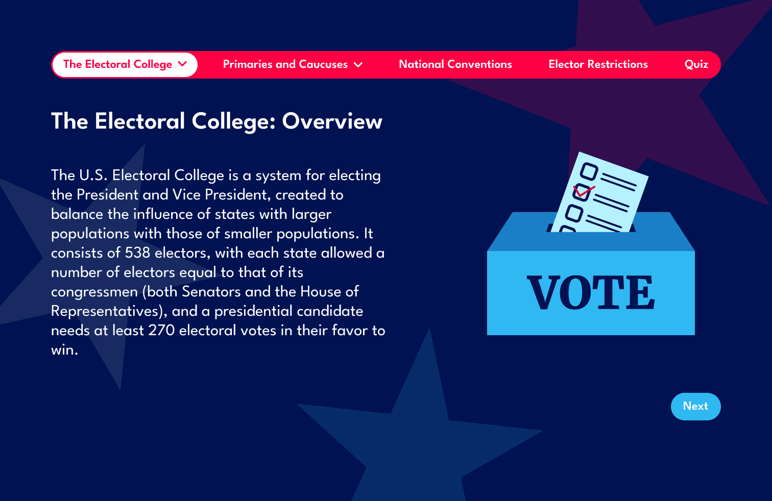
Explain the Electoral College, the number of electors per state, and the amount of electors needed to win.
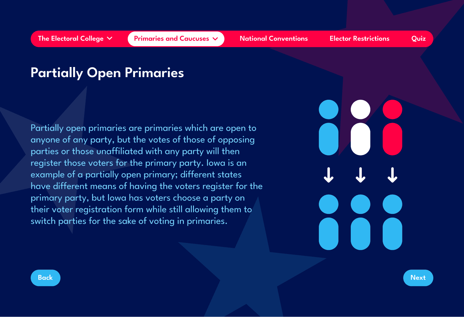
Explain the difference between Open Primaries, Closed Primaries, and Caucasus.
Explain the Republican & Democratic National Conventions, the number and role of delegates and superdelegates, and the number of delegates per state/territory.
Challenges
Information Architecture - How to organize everything in a way that made sense
Audience - How to appeal to a wide audience, but especially younger or less experienced voters
Infodumping - How to deliver all information necessary, but in digestible pieces for the user to click through
Final Result
As I researched the information required for this project to make sure everything was factually correct and explained as simply as possible, I found that looking at the sheer number of words in each area helped a lot in organizing everything in a way that split up the larger sections or blocks of text, even if that organization didn't make as much sense to me categorically. Rather than simply cutting information from my notes, I focused on splitting up any lengthy sections so the amount of information in the entire project was the same as what I had originally written in my notes, but split up more effectively for users to read little bits at a time and not be too overwhelmed.
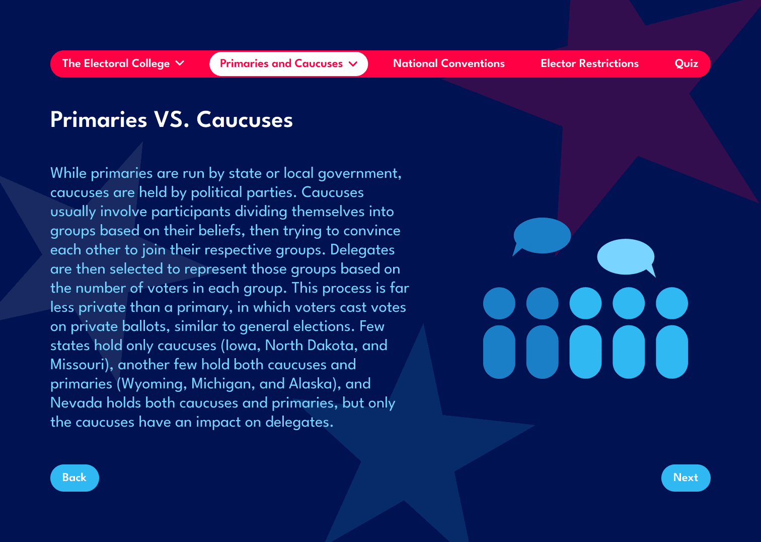
I decided to rely on simple graphics and brighter colors to appeal to young people, who probably don't know this information as well as experienced voters. Some of these graphics were just generic, voting-related subject matter that didn't directly support the text next to them, while graphics in the primaries/caucuses section were directly showing who could participate in each type of primary. I'm not super into creating logos or simple vector graphics, so these were a bit out of my comfort zone, but I still was able to create some effective imagery to accompany the text in my project.
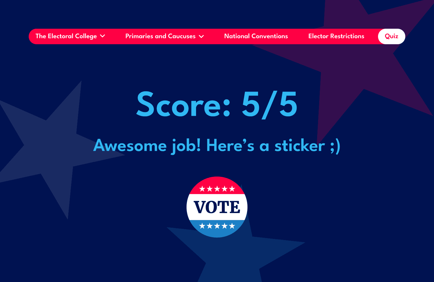
I'm very happy with how my final project turned out, especially the quiz feature I included at the end. I used variables in Figma to customize the ending screen of the quiz based on how the user answers the questions, so I'm glad I was able to demonstrate my prototyping skills in Figma that I had learned from working as a UX designer at John Deere. You can view and interact with this prototype here.